Thumbnail Breakdown Examples
See how VidLint catches weak focus, bad hierarchy, and missed potential before you burn impressions on YouTube.
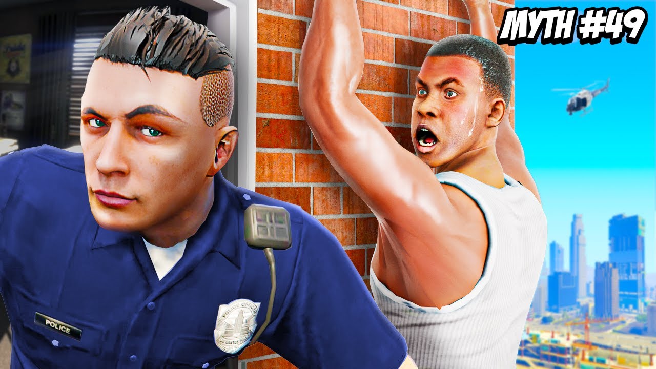
Top Problems
- Split focus between the cop and Franklin. Both faces are strong, but the viewer is not sure who the main subject is in the first second.
- "MYTH #49" takes up too much premium space without adding much curiosity. It tells the series number, but not the actual payoff or tension.
- The helicopter is too small to matter. It adds noise, not story. On mobile it reads like a random blur.
Direct Fixes
- Make Franklin the clear hero. Crop 15–20% tighter so Franklin’s shocked face and hanging pose dominate the center-right.
- Reduce “MYTH #49” by around 25–35% or move it to a less dominant corner. Keep it as branding, not as the main hook.
- Push the cop slightly darker and add more contrast/rim light to Franklin. This keeps the cop useful as context while making the main emotional payoff clearer.
Why this matters
This thumbnail already has strong emotion and a clear GTA-style look, which is good. The problem is hierarchy. On mobile, the eye bounces between the cop, Franklin, and the big text instead of locking onto one unforgettable moment. If the viewer has to decide what the thumbnail is about, you lose speed.
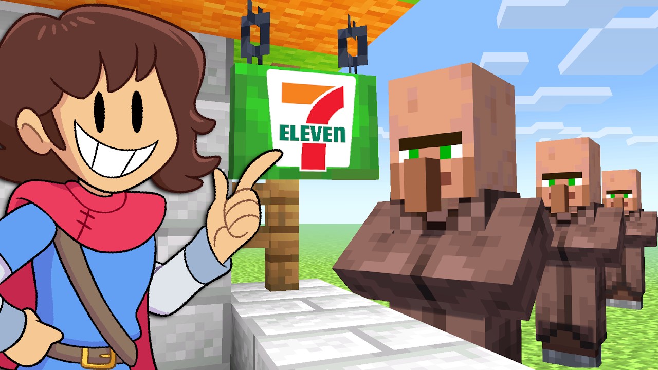
Top Problems
- The thumbnail explains the setup, but not the payoff. You can tell it’s Minecraft + 7-Eleven, but there’s no strong tension, surprise, or “why I need to click” moment.
- The cartoon character steals too much attention from the actual Minecraft idea. The face is big and readable, but it competes with the store sign instead of supporting it.
- The villagers feel passive. They are useful context, but right now they look like background extras instead of part of the hook.
Direct Fixes
- Make the 7-Eleven build the undeniable hero. Crop slightly tighter so the store sign and counter area feel more central and important.
- Give the villagers a clearer role in the story. Show one villager at the counter or reacting in a way that makes the “opened a store” concept feel active instead of static.
- Reduce the cartoon character’s visual weight by 15–25%. Keep the character for personality, but let the actual Minecraft store concept lead the click.
Why this matters
This thumbnail is already clean and readable, which is good. The weak spot is story tension. Viewers understand what the video is about, but not yet why this version is interesting enough to click now. In gaming thumbnails, clarity gets you noticed — but a stronger payoff moment gets the click.
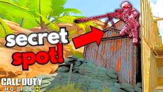
Top Problems
- The thumbnail sells one “secret spot,” not six tips. The viewer sees a single sniper location trick, so the packaging clashes with the video title.
- The pink sniper character looks unnatural and slightly confusing. It stands out, but it also feels edited in rather than part of the real gameplay moment.
- Too much space is spent on the arrow and bright empty background. The core idea is there, but the thumbnail is not using its best space to increase clarity or tension.
Direct Fixes
- Match the thumbnail to the real promise. If the video is about 6 tips, show either multiple tip elements or make the thumbnail clearly feel like “one of several secrets,” not the whole concept.
- Reduce the arrow size by around 20–30%. Keep it for direction, but let the actual “secret spot” and sniper setup do more of the work.
- Make the hidden position clearer than the character skin. Shift attention toward the rooftop/hiding angle so the viewer instantly understands why this spot is useful.
Why this matters
This thumbnail gets attention fast, which is good. The problem is expectation mismatch. Viewers click expecting one hidden sniper spot, but the title promises a broader “6 tips” video. When the thumbnail and title are pulling in different directions, the click becomes weaker and trust drops.
Don't guess on your next upload.
Upload your thumbnail design and catch exactly what's holding it back before you publish.
Try VidLint on your thumbnail